
Most business reports are written to be accepted, not questioned. Slides appear with clean charts, bold numbers, and confident labels. The meeting moves on. Budgets shift. Campaigns launch. Staff get reassigned. Very few people pause to ask the quiet, crucial question: “Does this number actually mean what we think it does?”
As data tools have grown more powerful, a strange thing has happened. We are surrounded by dashboards, automated reports, and instant summaries, yet many teams feel less confident about their decisions, not more. The problem is rarely a lack of numbers. It is the habit of treating those numbers as facts instead of evidence.
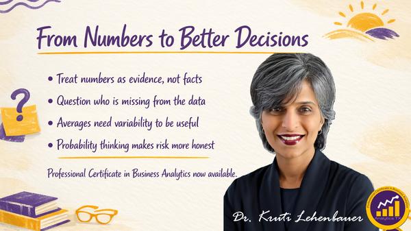
The Professional Certificate in Business Analytics from Analytics TX is built around a different mindset. It treats business statistics as a language for decision-making, not an abstract math exercise. The focus is not on complicated formulas or advanced software. It is on learning to interrogate reports, spot fragile numbers, and recognize when a “strong result” is actually a data collection issue.
In this article, we will walk through the core ideas behind the certificate. You will see how sampling choices shape conclusions, why averages can mislead you, and how probability quietly controls campaign performance, staffing plans, pricing, and inventory risk. We will explore examples from email marketing, digital advertising, and sales reporting, all drawn directly from the program’s approach. If you sit in rooms where numbers drive action, this is about learning to read those numbers as arguments, not answers. By the end, you should have a clearer sense of what it means to treat every metric as a question: “What is this actually telling me about the system I work in?”
Collecting and Organizing Data: Where Most Bias Begins
Every metric you see in a report is the end of a story that started with data collection. Before anyone calculated a rate, a trend, or an average, someone decided what to measure, whom to include, and how to record it. Those choices are where bias enters the system. If you ignore that stage, you inherit its flaws without knowing it. The certificate begins with sampling and organization because most business mistakes are born there. A sampling method is simply how you choose which cases to look at. It might be customers who clicked a link, employees who completed a survey, or orders from a particular region. The tempting assumption is that “a sample is a slice of reality.” Often it is not.
Consider a follow-up survey that only includes customers who respond. Your eventual “conversion rate” from that survey is not about all customers. It is about a self-selected group of people who are willing, available, and motivated enough to answer. In the certificate, this is not treated as a minor technicality. It is treated as a core skill: learning to ask, “Who is missing from this data, and how might that absence distort our conclusion?”
Frequency distributions and organized tables sound dry, but they matter because they show you what your sample really looks like. Are most observations clustered in a narrow band, or spread across extremes? Is one group heavily overrepresented? When you lay out data clearly, patterns of bias and gaps in coverage become visible.
Another key piece is recognizing how data collection methods can quietly “decide” the results in advance. If you only track success for leads that reach the proposal stage, your pipeline metrics will always look stronger than reality because every earlier loss is invisible. The certificate trains you to trace any reported number back to the process that produced it. You move from asking “Is this number high or low?” to “High or low compared to what, and under what selection rules?”
In daily work, this means questioning dashboards, not out of cynicism, but out of respect for decisions. Before you act on any number, you ask whether the way it was collected supports the choice you are about to make. That habit alone reduces many avoidable mistakes.
Reading Averages and Variability Without Being Tricked
Most business conversations lean heavily on averages. Average order value. Average response time. Average revenue per employee. These metrics feel solid and intuitive. Yet an average compresses a lot of detail into a single figure. Without understanding variability, you can easily misread what that figure really implies. The certificate covers mean, median, range, variance, and standard deviation, but not as a list of formulas. Instead, it ties each measure to a practical question. The mean asks, “What is the balance point of our data?” The median asks, “What does the middle case look like?” The range and variability ask, “How much does reality jump around behind that simple summary?”
Imagine two sales teams with the same average monthly revenue. Team A has most reps performing around that number. Team B has a few stars and many struggling reps. If you only look at the average, they seem equal. Once you look at variability, you see two very different management problems. One team needs broad coaching and process changes. The other needs retention strategies for top performers and better support for the rest.
Outliers are central here. A handful of extreme values can drag a mean upward or downward, creating a misleading sense of typical performance. If one or two very large deals anchored your quarter, your “average conversion rate” might hide the fact that most leads underperformed. In the certificate, you learn to ask, “If I remove the top and bottom few values, does the story change?”
Comparisons across teams, periods, segments, or divisions depend heavily on these ideas. When you compare two regions, is the difference in their average truly meaningful, or could it be random variation from small sample sizes? When you examine two campaign periods, are you comparing similar audiences, or did the underlying mix change?
By treating averages and variability as lenses instead of final answers, you get closer to what matters: whether the patterns in your data reflect real shifts in your system or just noise. This is what lets you distinguish between a meaningful trend and a one-off spike that should not drive a strategic move.
Probability Thinking in Everyday Business Choices
Probability often sounds abstract until you notice how many decisions quietly depend on it. Email campaigns, staffing schedules, pricing scenarios, and inventory buffers all hinge on how likely certain outcomes are, and how those probabilities interact. The certificate’s third module is about making that thinking intuitive enough to use in real time.
A core idea is defining events correctly. In practice, “event” can mean “customer opens email,” “visitor watches an ad,” or “order arrives late.” If you define the event too broadly or too narrowly, your probabilities will describe the wrong outcome. You might correctly calculate the chance that someone opens at least one email but forget that your revenue depends on the far smaller group who open all three in a sequence.
The email example from the program captures this sharply. A 5+% open rate per email can sound respectable. Yet when you look at a 3-email sequence, only a handful of clients open all three. Those few are your most likely buyers. The lesson is not just numeric. It is strategic: targeting the right subset matters more than blasting a larger list. The skill is interpreting joint probabilities before setting your campaign strategy.
Conditional probability also plays a quiet role in staffing and risk. The chance that you will be understaffed during a peak hour is not simply “average traffic times average absence rate.” It is about the probability of high demand given certain conditions, like season, day of week, or concurrent promotions. Once you start thinking in conditional terms, you see how fragile many “back of the envelope” plans really are.
Sometimes the math reveals that your intuition was too optimistic. Other times, it tells you when a risk is so small that your gut’s anxiety is not justified. A key theme in the certificate is knowing when to trust your intuition and when to overrule it with structured probability reasoning. This gives you a more grounded way to balance caution, opportunity, and resource allocation.
Seeing Through Attractive Numbers in Marketing and Reporting
Marketing and performance reports are full of attractive numbers. High conversion rates. Impressive engagement levels. Strong satisfaction scores. The certificate trains you to look past the appeal and ask what each number can truly claim.
Take the digital advertising example provided in the program. If a large percent of customers who watched your ad bought the product, that sounds like a huge success. But then you learn that only small percent of your customers saw the ad at all. When you step back and ask how many total buyers were actually influenced by the ad, the picture changes. Bayes-style reasoning reveals that fewer than half of all buyers came through that path. The rest arrived through other channels.
The problem here is confusing a high conversion rate among viewers with broad attribution for overall sales. Without careful interpretation, a strong looking conditional probability becomes an inflated story about impact. The certificate emphasizes this distinction, because overclaiming a channel’s influence can lead to misplaced budgets and misaligned strategies.
Similarly, in reading business reports, you might see a sales conversion rate of 40 percent and feel confident. Yet if that rate is calculated only among customers who responded to a follow-up survey, the figure is conditioned on response, not on all leads. Non respondents are invisible. If they had lower conversion rates, your true performance is weaker than the report suggests.
This is not just a technical quibble. It changes how you judge your funnel, your messaging, and your customer experience. The skill you develop is identifying when the data collection method has already biased the story. You learn to ask, “Is this number describing all relevant cases, or only a filtered subset that happens to be easier to reach or measure?”
By building these habits, you protect your team from chasing flattering but fragile metrics. Instead, you focus on numbers that withstand scrutiny and thus can support defensible decisions about campaigns, staffing, and investment.
From Reading Reports to Asking the Right Questions in Meetings
A central promise of the certificate is shifting your role in decision rooms. Instead of being the person who nods along with whatever the dashboard shows, you become the one who asks precise, grounded questions about what the data really supports. This does not require advanced technical tools. It requires a different way of listening to numbers.
You start by translating every metric into an implied claim. A 16.7 percent open rate quietly claims something about audience engagement. A 40 percent conversion rate claims something about how persuasive your funnel is. A “high performing ad” claims something about its influence compared to other channels. Once you see these claims, you can test them.
Questions like these become natural:
- “Is this rate calculated on all users, or only a selected group?”
- “How large is the sample behind this trend, and how variable is it?”
- “What events are included in this probability, and what is left out?”
- “If we changed the sampling frame, would this conclusion still hold?”
The certificate’s structure, with modules on data collection, averages, variability, and probability, is designed to build that questioning mindset step by step. The viva session with Dr. Kruti gives you a chance to articulate how you see these issues in your own context, reinforcing that this is about live decision-making, not exam performance. When you carry this mindset into your work, you start noticing how often reports silently assume that data is complete, unbiased, and directly actionable. Instead of accepting those assumptions, you bring a clearer standard: numbers are inputs to judgment, not substitutes for it. Over time, that small shift changes how your team treats evidence, how it manages risk, and how it explains decisions to stakeholders.
Key Takeaways
- Data collection choices shape conclusions long before any analysis begins. If your sample excludes quiet, unhappy, or less engaged participants, your metrics will be biased toward the voices easiest to hear. Always ask who is missing from your data.
- Averages without variability are half blind. Two groups can share the same mean but behave very differently when you consider spread and outliers. Decisions about teams, regions, or time periods should always check how stable or uneven the underlying data is.
- Probability is already embedded in your business decisions. Campaign sequences, staffing plans, inventory buffers, and risk assessments all rest on chance events and their combinations. Learning to define events clearly and think conditionally makes those decisions more honest and grounded.
- Attractive numbers can hide fragile logic. High conversion among viewers or respondents does not automatically mean broad impact across your full customer base. Always translate conditional metrics into statements about total outcomes before shifting budgets.
- Data collection methods can pre decide what data will show. Surveys, funnels, and dashboards that ignore non respondents or early drop offs create an artificially positive view of performance. Recognizing this protects you from overconfident decisions.
- The real skill is interpretive, not computational. The certificate focuses on understanding what numbers mean in context, rather than on performing complex calculations. Interpretation is what makes a metric useful for defensible decisions.
Conclusion
Business environments run on numbers, but they are sustained by judgment. A report is not a verdict on reality. It is a structured guess built on choices about what to measure, whom to include, and how to summarize patterns in messy human systems. The Professional Certificate in Business Analytics: Data-Informed Decision Making from Analytics TX is built around this recognition. It treats data as something to be read, questioned, and translated into defensible action, rather than something to be admired at a distance. By focusing on sampling, organization, averages, variability, and probability, the certificate equips you with a vocabulary for challenging easy conclusions. The examples of email campaigns, digital advertising, and biased sales data are not edge cases. They are everyday situations where a slightly sharper interpretation can save money, protect reputations, and improve outcomes for teams and customers.
Perhaps the most important shift is identity based. You move from feeling obliged to accept the number on the slide to feeling responsible for understanding it. With that responsibility comes influence. When you can explain why a result is fragile, or why a trend may be more noise than signal, people listen. Decisions slow down just enough to improve. In a world where dashboards multiply faster than genuine insight, the capacity to interrogate numbers is a strategic advantage. You do not need to be a statistician to develop it. You need a structured way to connect statistical ideas to the decisions you already make.
How might your own work change if you treated every impressive metric as the beginning of a conversation, not the end of one?