
You have seen this happen in meetings. A number appears on a slide, everyone nods, and the conversation moves straight to action. More budget. Fewer staff. A new campaign. A pricing change. But small shifts in wording can change what a statistic really means.
Consider these two sentences:
“The average company in the USA hires 6 HR professionals.”
“The USA company hires 6 HR professionals on average.”
They sound close. They are not doing the same work. One points to a pattern across companies. The other sounds like a statement about a single company.
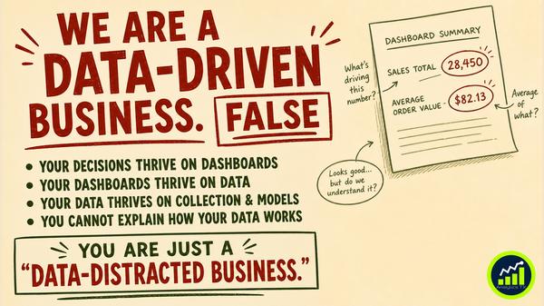
That gap matters because most business reports are read, not interrogated. Data tools have made numbers easier to produce. They have not made them easier to interpret. If you work with dashboards, forecasts, or performance data, you already know that reading a number and understanding it are not the same thing.
The real value is not only describing what happened. It is learning how to ask why the number looks true, what shaped it, and whether it can support a decision at all. That is the shift this certificate is built to address.
How This Certificate Moves You from What to Why
The Professional Certificate in Business Analytics: Data-Informed Decision Making focuses on a practical business problem: how to interpret numbers before acting on them. It is not about calculation for its own sake. It is about making decisions that are defensible because the meaning of the data has been examined first.
The certificate is self-paced across 3 modules with about 3 hours of video content, followed by a 15-minute viva with Dr. Kruti. It is based on Dr. Kruti’s published book, Introduction to Business Statistics, with original examples, custom graphics, and scripts written exclusively for this certificate.
What it covers:
- Collecting and organizing data: This includes sampling methods, frequency distributions, and data collection and organization. The point is to see how collection choices shape the story the data can tell.
- Interpreting averages and variability: Mean, median, range, variance, and standard deviation are covered with attention to outliers. This helps readers compare teams, periods, segments, or divisions more carefully.
- Probability for business decisions: The content covers defining events correctly, probability rules, and conditional probability. This matters when decisions involve campaigns, staffing levels, pricing, or inventory risk.
- Reading reports with skepticism: A dashboard number may reflect a real pattern, or it may reflect a data collection problem. The certificate trains readers to tell the difference.
The Cost of Accepting the Slide at Face Value
When teams act on numbers they have not really interpreted, the risk is not abstract. It shows up in business decisions that look rational in the moment but are weak under scrutiny later.
- What happens if a 40% conversion rate only reflects customers who answered a follow-up survey? What happens if you treat that figure as representative of all customers? You may invest more in a tactic that only looks strong because the collection method filtered the result before anyone read the report.
- What happens if 90% of customers who watched an ad bought the product, but only 12% saw the ad at all? If you confuse high conversion with broad attribution, you may over-credit one channel and underinvest in others that are doing more work.
- What happens when a sample is too small, too biased, or too narrow for the decision being made? Staffing, pricing, campaign planning, and inventory choices become harder to defend. The cost is more than a wrong answer. It is slower decisions, weaker confidence, and more risk when business conditions change.
If numbers are driving your decisions, can you explain what those numbers actually mean before you act on them?
What to Test Before You Trust a Number
If you want better decisions, start by slowing down the moment between seeing a number and accepting it. These checks are simple, practical, and grounded in the same business questions this certificate addresses.
- Check the data source: Before discussing the result, ask how the data was collected and who is missing from it. A number built from a narrow or biased group may answer a different question than the one your business needs answered.
- Name the right average: If a report uses an average, ask whether mean, median, range, or variability gives the clearer picture. Outliers matter, especially when you compare teams, periods, segments, or divisions.
- Test the sample fit: Ask whether the sample is too small, too biased, or too narrow to support the decision being made. This is especially important when budgets, staffing, pricing, or campaigns are on the line.
- Separate pattern from problem: When a dashboard number changes, do not assume it reflects business reality right away. First ask whether you are seeing a true pattern or a data collection issue.
- Define the event clearly: In campaign and attribution analysis, make sure the event being measured is stated correctly. The email example shows why joint probabilities matter, and the advertising example shows why a strong rate does not always mean broad influence.
A Better Question Changes the Decision
This work is not always easy. It asks you to pause when others want to move quickly, and to question numbers that look clean on the slide. But better business decisions often begin with that pause.
The goal is not to become more technical for its own sake. The goal is to become the person in the room who knows when a number is solid, when it is fragile, and what more the business needs before acting.
If the difference between two similar sentences can change the meaning of a statistic, what other numbers in your work deserve a second look?
Register for the Professional Certificate in Business Analytics today: https://www.analyticstx.com/certificates